WSJ fudges truth in caption
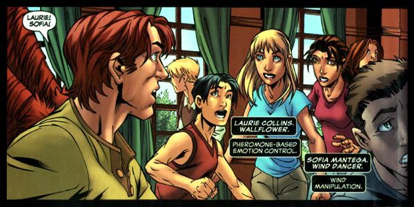
Eagle-eyed New X-Men readers may have noticed that the picture in the Wall Street Journal's article by Brian Steinberg titled "Look -- Up in the Sky! Product Placement!", which I linked to yesterday, contained a panel noticeably altered from its original published appearance in New X-Men #20.
The caption accompanying the picture reads, "Nike product placements in the Marvel comic book 'New X-Men.'" This is, however, ultimately inaccurate, as this same panel in the published version does not have the Nike emblem on Wallflower's shirt. Thus, this is not an example of Nike product placements in a Marvel comic book; though it is certainly an example of how Nike product placement might theoretically appear in a Marvel comic book.
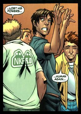
 If the WSJ wanted to be on the ball here, they would instead have captioned it, "A Photoshopped panel depicting Nike product placement on a page that included actual Nike product placements in the Marvel comic book 'New X-Men,'" as there is a Nike shirt on the page; it just doesn't appear until the next panel. You have to wonder why this was -- if the WSJ turned the reference into a more recognizable Nike logo, or perhaps it was from an earlier draft of the book from the Marvel office. I don't know. But there are surely numerous actual examples they could have selected instead. Thanks to our own eagle-eyed Stephanie for the tip.
Update, April 21: "ph" left a comment on this post that we wanted to highlight:
i'm the art director at the Wall Street Journal who worked on this page, and the X-men image in question. as one of your anonymous post-ers said, this is what we got from Marvel, and we used it. this is obviously a panel pre-production, pre-lettering. as for Ggg of the Sand, yes, the woman more eye-catching, and the swoosh is THE iconic image of nike. sure, i saw the other nike-like thing on the back of the guy's shirt, but it didn't scream out Nike, so we went with the swoosh on the front of the tshirt. (in fact, if you look closely at the guy, his shirt seems to spells "NKE" so i wasn't even sure we were dealing with nike in that example). in closing, i'd like to assure that the journal doesn't photoshop or in any way alter our images.


6 Comments:
Has it occurred to you that Marvel may have supplied unlettered art to the WSJ? It's clear that's not from the finished art anyway, and that the lettering is covering where the WSJ has the logo.
This comment has been removed by a blog administrator.
Doesn't it seem odd that the Wall Street Journal would take the time to Photoshop comic art for a story when they could just call up Marvel and ask for the artwork?
I suspect that they aren't to blame for this, that that's what Marvel gave them and they went with. Their only crime seems to be trusting Marvel (something every comic fan is guilty of) and not buying the comic in question to check and see if the panel appeared like that (and who can blame them for not wanting to buy an issue of New X-Men?)
Could it simply be the sad fact that it is far more sexy, in multiple senses of the word, to display the Nike "swoosh" across the chest of a young female? Certainly more eye catching than written on the back of a "big boned" young male, no?
hi. i'm the art director at the Wall Street Journal who worked on this page, and the X-men image in question. as one of your anonymous post-ers said, this is what we got from Marvel, and we used it. this is obviously a panel pre-production, pre-lettering. as for Ggg of the Sand, yes, the woman more eye-catching, and the swoosh is THE iconic image of nike. sure, i saw the other nike-like thing on the back of the guy's shirt, but it didn't scream out Nike, so we went with the swoosh on the front of the tshirt. (in fact, if you look closely at the guy, his shirt seems to spells "NKE" so i wasn't even sure we were dealing with nike in that example). in closing, i'd like to assure that the journal doesn't photoshop or in any way alter our images. this one was lightened, but only b/c of the dull reality of printing on newsprint: ie, it's very low-grade, poruous paper and muddies up, so you have to lighten art to make sure its readable. as for "putting a ruler across both versions" not sure what to say about that. maybe after the black speech bubble covered the logo, the inker went back and took out the swoosh? nothing nefarious on our end.
ph, thanks for your comment; I'm adding part of it to the main post to clear up any confusion. It's also interesting hearing your perspective on how you choose an image to accompany a story.
FYI, the caption is still incorrect. (grin)
Post a Comment
<< Home