


Outside View: Is "Sin City" Rodriguez's missed opportunity?
Ive gotten into a number of disagreements about Sin City. Comic book fans are impressed with how Robert Rodriguez left the Directors Guild just so Frank Miller could be listed as a director. Theyre being blown away by ever still and frame from the movie that honestly DOES look as if the comic itself has been meticulously recreated with live actors.
So you can imagine all dirty looks I get when I say Im disappointed with everything Ive seen so far. It isn't that I'm not anticipating the film or respectful of the choices that Rodriguez and Miller have made. It's that I was really hoping for Rodriguez to use his knowledge and style to produce something Hollywood needed to see: The first digital noir.
"Sin City" is anything and everything but a noir piece. Look at the trailers, the posters, even the little loading flash artwork on the movie's homepage. Sure, it's all beautiful contrast. Everything looks like a spectacle of color and bright, vivid imagery, which, for a noir-style, (mostly) black-and-white adaptation of a dark, gritty comic about the underbelly of crime, makes it seem well off base.
Once Georgy Lucas showed Rodriguez the digital cameras he used on Episode II, Rodriguez became an apostle of digital cinema, spending almost every chance he gets pushing the HD digital medium to filmmakers. One of the special features on the Once Upon A Time in Mexico DVD is quite literally him giving a talk on how "film is dead." Bold words. So naturally, I assumed his adaptation of Sin City would be heralded with trumpets: the digital noir is here!
Well, the digital noir is here. And we have Michael Mann to thank. Not Robert Rodriguez. His Collateral did more for digital cinema than all of Rodriguez films combined. Though shot in nighttime, every frame is filled with phosphorescent hues and details which have never been captured on film in such a way. The spectrum of grays in great black and white noir films like The Third Man and dark murky colors and shadows of Chinatown had been at last usurped by the clear hues and darkened details of Collateral.
And why not? Digital film has been praised time and time again for its ability to operate under low-level and irregular lighting conditions to the point that there have been movies shot under the light of only candles. Rodriguez himself talks about how great the kind of freedom he had with the low level lighting during the cantina shootout sequence in the beginning of Once Upon A Time in Mexico.
But clearly, Rodriguez has discarded film noir in exchange for "digital blanc". In order to capture the strong, contrasted images of Miller's comic artwork, he had to blow out tonality, oversaturate the whites and use computers to selectively colorize certain objects and people to produce the cinematic equivalent of PhotoShops posterize tool set one level too high. Its an incredibly effective look that captures the look and stylistic feel of the artwork. But in ways, it hardly seems appropriate.
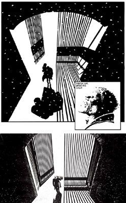
When filmmakers began shooting film noirs all those years ago, it was partly an attempt to explore the limitations of their cameras under darkened settings. It wasnt about using black and white, it was about using grey. The stories were dark, ambiguous tales where there are no white or black hats. Everyone is a little dirty. The grays captured that reluctance to trust any man because he always seemed to be lurking in shadows. But, and this is my own opinion, in order for Miller to capture such a tone in print, he would naturally have to do the exact opposite. All comics are full of shadow and shades of halftone gray, even insipid daily comics in your local paper. So by using only black and white, Miller is able to literally eliminate the detail. His characters aren't hidden in the murky shadow. They're hidden in the dark and the light. Rodriguez's attempt to emulate that tone is working in the wrong direction. It's a copy of a copy. Yes, he's capturing the look, but at what expense?
Ultimately, it'll rely on a heck of a lot more than just a visual polish make this film a success. Anyone who has sat through Rodriguez's oeuvre knows he is not a man who can handle story properly. He's more of a conceptual storyteller than a clearly lineated storyteller (which is odd considering that his book, "Rebel Without a Crew," is practically a daily diary of his own life). Also, he's not exactly a great dialogue guy. Hopefully Miller handled that element of the writing. That said, there's still always that intangible spark that resides outside of the writing and directing. Unofficially, we can call it "the feel." No matter how bad the dialogue or how grotesque the visuals could be, if the movie captures "the feel" of the comic, it'll be golden.
The point of all that? Well, a new trailer is out and it's a heck of a lot better than anything that's been released for the film so far. Considering we're less than a month away from release though, that is hardly a good sign. This film clearly has a case of marketing trouble. This time around, it feels like its trying to push itself as the next "Kill Bill" (note the sudden conspicuous appearance of a certain QT). Meanwhile, the trailer emphasizes the lack of one cohesive story to sell to audiences. Instead, it relies on some names, half of which people may or may not recognize, and a visual style that looks truly unique and daring. Remind me again. What was the last movie that advertised itself that way? Also, I'm noticing a slightly dirty yellow tinge to the trailer. Wouldn't it be horrible if they color timed the whole movie to look like it's on faded newsprint?
Also, Yahoo! has a lot of great comparison stuff for those of you who want to see just how off my rocker I may be. I guess we'll all find out just exactly how right or wrong I am come April Fools.
posted by H.G. @ 11:55 PM
![]()

0 Comments:
Post a Comment
<< Home